
The Top 3 Exit-Intent Popup Best Practices
An exit-intent popup is an animal in comparison to other list building tools. The success rate can reach 35%, which is more than 8 times better than a simple opt-in form at the bottom of your website.
Moreover, the popup that appears on the exit gives you an additional chance to re-engage with your site visitor which is about to leave. So you can kill three birds with one stone — actively collect email addresses, reduce your store’s abandonment rate AND increase your sales.
Let’s dig and see what the exit-intent popup should be like to bring such great results.
How Does the Exit-Intent Popup Work?
Before we start analyzing the best practices, let me introduce how it works.
An exit-intent popup monitors visitor’s behavior. When a mouse cursor moves to the Close button, URL address bar or anywhere else in browser’s toolbar, a popup jumps out.
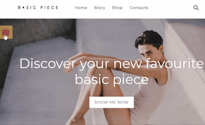
Remarkably, it’s not so annoying to your site visitors because it doesn’t interrupt browsing at your store.
One more very important benefit of this popup is that, normally, it contains a bold and tempting offer, the visitors can’t resist.
So don’t leave your money on the table. Learn about the best practices and launch your exit-intent popup without delay.
Top 3 Exit-Intent Popup Best Practices
First of all, pick a tool for your popups. Usually, email service providers also host popup creating studios. That can be an option. Just make sure that the tool is user-friendly — you will have to be able to make changes easily and monitor once the popup is launched.
For example, on Omnisend platform, it takes up to a few minutes to launch the new popup. You can easily modify its copywriting, design and position on your site within the seconds. The tool also provides a big library with ready-made popups that you can use out of the box.
As you already know the background, let’s learn how to craft a perfect exit-intent popup.
1. Clearly convey the offer

An exit-intent popup appears on the moment when a visitor is about to leave your site. They don’t have time to read your long proposals.
That’s why it is crucial to be bold — to get noticed, to be short — to be read, and to be valuable to get the visitor’s email in return.
This is a short checklist on how to do that:
- Exit-Intent popups work best when they offer something valuable for a visitor. Decide on what incentive you will use: 10% off, $5 off, free shipping, a gift guide, etc.
- Write a short and clear statement about your offer. It has to be no more than 1-2 short sentences that reveal the benefits to the visitor.
- Don’t put multiple data fields into this signup form. Ask only for an email or an email and phone number/name (it depends on what information you collect with other signup forms).
- Use the popup design which fits your website design but stands out somehow.
See the great example of changing a regular call-to-action button into more actionable one:
“Get $10 coupon” button looks bold. A button like this performs better than a regular “Subscribe” button because you emphasize the offer.
If the shipping expenses are quite high at your store, I would recommend you including free shipping for the first order. The unexpected and high shipping costs are the reason #1 why people abandon the shopping cart. So this kind of proposal could help with reducing your cart abandonment rate.
2. Don’t be boring
Instead, be funny, be sexy, be bold!
The exit-intent popup is your last chance to stop your visitor from leaving your site, so grab their attention.
You can do this with an unexpected offer, a joke (just make sure somehow it relates to your business), provocation or even the game.
To understand what I mean, see the examples below.
Example #1. Unexpected and funny

The offer is supported by an unexpected and funny image. It catches the visitor’s attention immediately and gives them a good emotion. As a result, they reconsider buying something from the store.
Example #2. Flirty

The marketing team of “Spoiled Brat” know how to flirt with their customers. Don’t they?
There is an old marketing rule — “Sex sells”. Don’t get it too literally and don’t cross the delicate line. But in some way, you can use this, and add an innocent flirt into your popup, just like this online boutique did.
Example #3. An interactive, unexpected game
This is Wheel of Fortune by Omnisend. But you can also find some alternative solutions provided by other email service providers.
In this signup form, you have to enter your email to spin a wheel and get the prize.
The point is, that this interactive, entertaining signup form can collect up to 3 times more email addresses than a regular one. Let’s game on!
Find more great exit-intent gallery here.
3. Use images
As you can see from above, popups can be small hooligans on your site. But they should fit your website design anyway.
Normally, images help to get the visitor’s attention. You can use images of your products, of people using/wearing your products, maybe even funny images, if you are launching a popup with a joke.
There are no strict rules about images on your site except from one. All imagery has to be of good quality.
And one more tip — avoid using the image as a background for the text. It might ruin its readability.
Conclusion
You spend long hours and a lot of money to acquire visitors to your website. Don’t let them go so quickly!
An exit-intent popup is your extra chance to stop them. This is an unrevealed marketing treasure. Which, I hope, you will finally reveal. And the best practices as well as examples above will help to do that.


Leave a Reply
Want to join the discussion? Feel free to contribute!